When used thoughtfully, typography can help to underpin a brand both visually and tonally, adding meaning and dimension to what is communicated. A balance of serif and sans serif provide flexibility to set the tone in disparate communications with varied audiences while maintaining a cohesive brand presentation.
StFX has fonts within its visual identity guide for casual ‘everyday use’ (e.g. to use in emails, letters, memos, PowerPoint, etc.) and another set of fonts strictly for professional designer use when creating publications. The Everyday Use fonts are presented below for your reference. For Professional Designer Use, please refer to pgs 25 – 29 in the Visual Identity Guide found here.
Calibri (Email, letters/memos, PowerPoint, etc.)
Calibri in two weights (regular or bold) is to be used for all emails, and as an everyday choice of sans serif font for other internally-produced communications such as letters, memos, etc. The ideal size in email copy for Calibri Regular is 12pt, and in a letter format is 11pt.

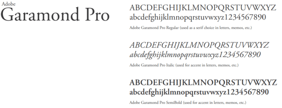
Garamond (Letters/Memos, etc.)
Adobe Garamond Pro in three weights (regular, italic, or semi-bold) is to be used as an everyday choice of serif font for internally-produced communications such as letters, memos. The ideal size in copy for the regular font in a letter is 12pt.


